Tuesday, October 18, 2011

The Evolution of the Triptych .

I could put this post in my Design Always Repeats Itself but I think that would be misrepresentation because the triptych never disappeared from the history of art and design.

Here is the Merode Altarpiece.


Probably the most famous altarpiece aside from the Ghent Altarpiece. This triptych was created in approximately  1425 by Robert Campin and an assistant. What makes this altarpiece so important is its use of symbolism and its misuse of perspective which illustrates the struggle to understand perspective before the Renaissance.

Last semester I did a paper on this altarpiece:


This is Altarchen by Gerhard Marcks and Alfred Partikel. Made while teachers at the German Bauhaus Marcks and Partikel decided to take a traditional subject and style and transform it by using modern techniques. 

Within both triptychs there is a lot of important symbolism but what I love most about Altarchen is its ability to take something as stagnant as the religious triptych, turn it on its head and make it relevant again. I mean, that's tough. I can't imagine taking something old and making it exciting again while maintaining its original integrity.

Gerhard Marcks went on to live on a long life and created the doors for a church in Germany which I can't locate today but they are amazing. As soon as I find them I'll post an image. 

Partikel had a tragic life and in 1945, in the midst of WWII, disappeared while mushrooming in Ahrenshoop. 

Enjoy!
-Grace


Monday, October 17, 2011

Tricky Treats!

As the Halloween season approaches, my thoughts often turn not to clever costume ideas that involve me wearing facial hair in some capacity, but to the creepy treats I can serve to costumed party-goers. Let’s face it. Nobody’s REALLY fooled into thinking they’re about to eat a handful of curiously pretzel-shaped “skeleton bones” when you put out a bowl of white chocolate Flipz, but just go with it, ok?

This year I’ve decided to up my game, plan ahead, and make sure I cover all of the major Halloween party food groups:

Fingers in a Bandage = Franks in Blanks w/ Slivered Almond “Fingernails”
*with Blood (Ketchup) and Puss (Mustard) for dipping!


Goblin Eyeballs = Deviled Eggs
* green food coloring will make those eyeballs really ghoulish!


BRAINS!! = Brain-Shaped Cheese Ball
*add a little pink food coloring for optimum effect and serve with Tris-CUTS, of course!


Dead Roaches = Dates Stuffed w/ Goat Cheese & Pecans


Jack-o-Vomit = Guacamole Spewed Forth from a Carved Pumpkin
*with a side or TORTURE-tilla chips, obviously!


Mush Mouths = Apple Slices w/ Caramel Cheesecake Spread & Marshmallow Teeth
*hmm…red lips or green? Which are Halloween-ier?


And if I get REALLY ambitious:
A Giant Pumpkin-Shaped Carrot and Veggie Dip Platter
*probably requires the least amount of effort, is the most festive, but is definitely not trick-y enough.


This one is for when Micky and I throw our future children one of those totally awesome Halloween parties that I remember from my youth, where kids bobbed for apples and blind-folded-ly felt their way through big bowls of cold spaghetti “worms” and peeled grape “eyeballs.” Ahhh. Those really were the days:  


Kitty Litter Cake !!


Made with regular chocolate cake mix, ground up Golden Oreos, and Tootsie Rolls for the most authentic litter look, I'm not sure anyone could actually overcome the visual and have a scoop, but it would definitely be the ultimate gross-out treat for such an occasion. Bon Appétit!


- Cathleen 

Friday, October 14, 2011

I'm Thinking About... Bull's-Eyes.

God, I love bull's-eyes.

American artist Kenneth Noland did a series of bull's-eyes and each one seems to have a personality of its own.

Turnsole
MoMA NYC
1961

Some a little less organized:

Quid
1960

Neat and composed, reckless and smudgy, they each tell a story and elicit different emotions from the viewer.

I can’t find the title of this one, but it’s one of my favorites.


And Half
1959

Kenneth Noland was a member of the Washington Color School which the Corcoran Gallery of Art sums up as: “…united by an exploration of the language of abstraction, a desire to experiment with materials, and a love of color.”

The bull's-eye has permeated our visual lexicon. It’s not only prevelant in the fine arts but also in pop culture and the decorative arts. The Who use a bull’s-eye as their band’s symbol:


Even Target uses the bull's-eye for their logo. Here is an image of the bull's-eye they used from 1962-1968 in their advertising:


I often think of archery and the game of darts when I think of bull's-eyes. Here are a few of my favorite sports related bull's-eyes:

An archery set from FredericksandMae.com. The wooden box is hand silkscreened.

And this Finnish dart set from kioskkiosk.com. I love the green and white concentric circlesso visually pleasing.

Here are some other cool bull's-eyes I have come across:

Bullseye Ashtray
1970’s
Available at Flair Home Collection in NYC

Fireman’s trampoline
1950’s
9ft wide
Available at T.C. Donobedian in San Francisco, CA.

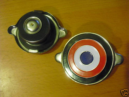
A radiator cap for AMC cars made from 1966-1980.

Have a great weekend! And please post any high-style bull's-eyes you see.

-Grace

Thursday, October 13, 2011

A Different Take on Paper Sculpture.

I stumbled upon these masterpieces while blog surfing.

Photo courtesy of the artist's website.

Andy Singleton is a paper artist and illustrator in England. His take on paper art is part origami part sculpture.

Here's some samplings of his work.

Photo courtesy of Nick Singleton.
Paper chickens for Hermes. 

Photo courtesy of Nick Singleton.
Paper boat for Hermes.


Photo courtesy of Nick Singleton.
Single paper chicken.

Photo courtesy of Nick Singleton.

Bravo, Andy. Artist's website here.

- Grace

Wednesday, October 12, 2011

Artist of the Week: Clea Minaker


Feist dropped a new album (Metals) last week and I had been counting down the days until it was unleashed. But this is not a review of said album. Which is beautiful, by the way. I think I need a few more days—nay, weeks—of non-stop listen-age before I will be able to conjure the right words to describe its great complexity. 


No, this post was inspired by my fond remembrance of the two concerts I saw far too long ago in support of her last album (The Reminder) and the amazing shadow puppet light show put on by Clea Minaker at both of them. Employing an old-fashioned overhead projector, Clea used her hands to manipulate paper cuts, mud, and other objects across the glass, casting illustrative vignettes on the bright scrim that stretched behind the musicians as they played.


Clea is a performance artist and puppeteer who lives in Montreal. Her blog
didn’t give me nearly enough of what I was looking for: clear footage of her genius in action. Seeing her work in the flesh (or shadow of the flesh, as it were) was truly breathtaking. Every graceful gesticulation quietly punctuated Feist’s words and followed her inflections perfectly. There is something really moving in a simple gesture writ larger than life across the screen. Like when a kid first realizes that a fist and two fingers can pitch a bunny head on the wall. Eureka! Alas, you and I will have to settle for what I could scrape up on Youtube:


In researching the artist, I discovered there was a documentary called Look at What the Light Did Now that was released last December and is not available on Netflix (of course I already checked) but is available on Amazon (of course I already Wishlisted it). The film covers the making of The Reminder, the concert tour, interviews with Feist and her creative cohorts, and features footage of the amazing Clea Minaker making shadow puppet magic. At least that’s as much as I could garner from the trailer and clip I found on Youtube here:


- Cathleen

[Photos courtesy of the artist’s website.]

Tuesday, October 11, 2011

Designing with Freedom in Mind.

My home was once featured on Apartment Therapy DC and in the interview I said I like the idea of designing with freedom being the inspiration. Upon reading the interview I realized what I said made no sense because I didn't expand on it and I came off as crazy. What I should have said is that I'm inspired by American symbols of freedom, such as red, white and blue, and eagles.

I think placing dramatic eagles in your interior is a way to reference freedom without hanging a flag above your sofa.

Here are some eagle items I think are especially beautiful and convey freedom without being over the top. 


This is a gorgeous 18th c. Italian carved and gilt eagle holding a placard. Available through the Kevin Stone gallery.

Here's an eagle made in the USA in the late 19th century. Carved and painted, this piece is dramatic and dynamic. Available through the Outsider Folk Art Gallery. 

A pair of eagle lamps via LUM. Price tag: $2,600.00 for the pair. Ouch! I can hear my wallet screaming from my purse. Still gorgeous and bold though.


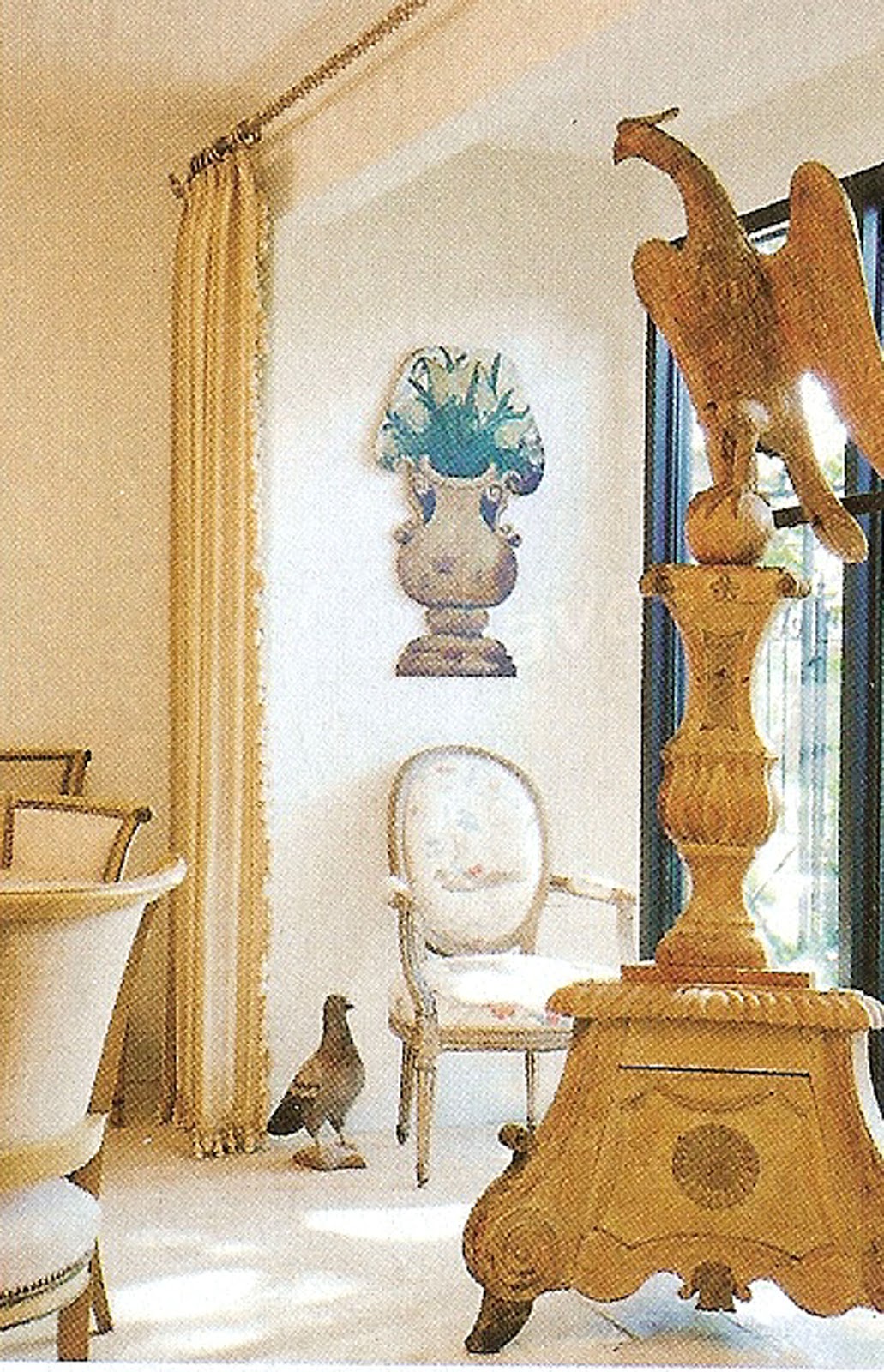
One of my favorite eagle pieces I've come across, a French eagle podium placed in a Charles Faudree interior. 
Excuse the crude image, it's a scan from House Beautiful. But it is a piece that speaks for itself as a free-standing sculpture. 

Here's a piece that's comparable for sale:
That can be bought here.

And finally my FAVORITE eagle piece that I had to dig out of my "archives" (that's fancy for magazine clippings) to find the image. 
Another scanned image and I have no idea where I found it, but isn't it impressive? So dynamic. This piece would define any entry way. When I hit it big, I am going to find one of these for my own home.

-Grace

Monday, October 10, 2011

Boom.


Now that's a statement piece. Aboriginal art meets grandma's junk jewelry drawer.
Noble House Designs is selling this beauty for $150 on Etsy. You could rock this necklace with a simple black dress and... that's it! Outfit complete! You can thank me for all of the compliments later. 


- Cathleen 


[Image courtesy of Noble House Designs on Etsy]
Related Posts Plugin for WordPress, Blogger...